
I am now inspired to re-design IOTA. I was looking for an excuse because I love to build new websites, and thought to myself if making the sites responsive could increase conversions on phones and tablets then that could legitimately give me reason to update them to a responsive design.

Current Statistics
For the periods Oct. 1, 2013 to Jan. 31, 2014, IOTA received 25% of traffic from tablets and 11.5% from mobiles with an ecommerce conversion rate of 0.05% and 0.02% respectively. Desktop conversion rate is 0.07%.
Ecommerce conversion rate for IOTA is low because most sales are done outside of the website shopping cart via email and phone. However, 99% of those originate from the website so the importance of a converting site is crucial
Additional IOTA metrics we can use are average time on site (currently 2.07 mins) and page views (currently 4.07)
These are not as specific as a $ amount and harder to quantify ROI, but we can surmise that the more time people are spending on our site and more pages they are visiting, the more engaged they are with the IOTA brand.
Research
I did some research and the numbers looked very promising. For example, O’Neill Clothing’s redesign achieved some fairly spectacular results on iPhone/iPod:
- Conversions increased by 65.71%.
- Transactions went up 112.5%.
- Revenue increased by 101.25%.
Similarly, on Android devices:
- Conversions shot up by 407.32%.
- Transactions increased by 333.33%.
- Revenue increased by a whopping 591.42%.
Even if we could only increase conversions on tablets and mobiles by 50%, then the cost of a re-design would pay for itself in as little as three months.
The research showed that revenues increased higher than conversion rates which confused me at first, but I think it means that people were actually buying more at a time.
Still, there is only one way to find out and that is comparing the before and after, which means I have to actually redesign the sites.
The Process
These two sites will be a good opportunity to provide really detailed case studies for my nickj.co audience. I can show the full design process that we go through and you can join the journey with us.
Over the coming weeks, we will take you through a step-by-step process that includes:
- Business owner interview – filling out a questionnaire from nickj.co
- Problem Statement
- Define business objectives
- Existing Website Review
- Mood Board
- Typography
- Style guide
- Feature/Functionality list
- Wire frame
- Technology decisions
- Final build
- Revisions
- Testing
We will start on IOTA first with an estimated time of about 6-8 weeks and then move on to GardenWare. Stay tuned.
Redesign of IOTA Designer Planters Stage One: Defining Business Objectives
Before attempting any web design, a thorough analysis on the website objectives is vital. The website is a reflection of the brand and a channel for the business goals to be achieved. Who is the product or service is for? What is the business trying to achieve? And How can the website assist?
To answer these questions, a deep look into the owners mind is necessary. The questionnaire below is some of what I require before I undertake a consulting project.
It was a bit strange doing it for myself, but it proved to be a worthwhile exercise. It concludes with a problem statement and confirms the website objectives and scope of this project.
| Name: | Nicholas Jones |
| Company Name: | IOTA Australia |
| Address: | 14 Snook St CLONTARF QLD 4019 |
| Email: | sales@iotagarden.com.au |
| Phone Number: | 0417 371 201 |
| Website: | www.iotagarden.com.au |
| How many people in your company? | 1-2 |
| Annual Turnover: | Less than $500,000 |
| What does your company do? What are the products and services you offer? | Supply garden planters for commercial and high-end residential projects |
| Who is your target market? | Architects, landscapers, builders, interior designers, and other business customers that have specific requirements, often extra large sizes and/or custom shapes. Private customers who are looking for something more elegant and longer lasting than the cheaper products readily available on the market. |
| Who are the decision makers for this project? | Nicholas Jones |
| What budget have you allocated for this project? | $5000-$10000 |
| What is your annual budget for digital marketing? | $20000-$50000 |
| What are the top 5 business needs of your digital strategy? | • Create awareness of the IOTA brand particularly to design professionals • Build a dialogue (communication process) with this market informing them of the product benefits and USP of IOTA planters. • Build trust within this market by presenting existing projects by their peers that have used the IOTA range successfully. • Directing customers to the website and encouraging them to use the resources available of case studies, product specifications and CAD drawings to make it easy for architects to specify. |
| Is there anything about your current site that serves the business well and if so, why? | Lots of great images, high level of detail on individual products including sizes, weights and volumes. Lots of content developed over a long period of time. |
| Tell us about your ideal customer. Who are they? | They value the brand of IOTA and high quality materials IOTA use that will result in a highly prestigious look and feel. They also value the longevity of IOTA planters and have the budget to afford a premium product. |
| What are the top 5 reasons your ideal customer will visit your website? | Build design professional researching for client. Buyer referred by their building/design professional. In research phase found IOTA by searching google In evaluation stage researching details of specific size, shapes and pricing of the ranges to plan a project or create a detailed design plan. Buying stage to place order. |
| Are the any other websites in particular that you like the design of? Why? | nab – use it regularly and always impresses, starting to look a bit dated. http://www.zazzle.com – bought some business cards recently and just liked the design, especially the responsiveness, even though I bought from a pc. |
| What does success look like? | Very similar site to what we have but a bit more modern looking and responsive in design. Would also like to see some usability issue looked at. The current site looks a bit busy to me and the text looks a bit small, I would like to see better use of white space, typography a bit more professional and result in a better flow. |
Problem Statement:
IOTAgarden.com.au site needs a redesign with a review of the current typography, colour scheme, content, structure and layout with a view to making it more modern, usable and less cluttered. The redesign needs to be responsive to any size device that visitors view it on.
The success of this will be determined through analytics metrics of ecommerce conversion rate, time on site, page views, newsletter sign up, catalogue downloads, and trade account sign up.
Pre and post design statistics will be compared to see if these metrics have been improved on all devices but especially mobile and tablets.
Website Objectives:
To be a visually elegant representation of the IOTA brand while making it very easy for visitors to use the site and find what they want on any size device they may be using.
Define Audiences
- Architects, landscapers, builders and designers that are researching and recommending for their client rather than themselves
- Business customers that are purchasing for their place of work. Restaurant and resort owners, local councils
- Private customers who are looking for something more elegant and longer lasting than other products available on the market.
Define User Needs and Tasks
Since IOTA is very focused on planters, all these customers come to the site with needs that are relatively similar. They all want to research and/or buy planters and need to know specifics such as shape, size and price.
Unlike some web sites like technology sites where the audience has varying levels of expertise in the area and different language needs to be used to cater for the different segments, IOTA is pretty straightforward.
Scope
This project is a redesign only and we are not looking at the quality of content, copy, images, SEO, etc. While these areas of digital marketing are equally if not more important than design, we need to focus on the task at hand and they are out of the scope of the project. Any obvious problems that we notice in development will be recorded and addressed in phase two once the design phase has been finished.
Redesign of IOTA Designer Planters Stage Two: Mood Board
A mood board is a collage that assists the designer and client in visualizing and experimenting with design concepts and ideas prior to committing to specific colours, fonts, images, and layouts.
For this project, it will be a collection of images and text samples organized in a method that helps explore the desired overall look, feel and tone of site.
It’s good to have some fun with this and ask the following questions.
If the brand was a biscuit/famous person/motor car what would it be like and why?
IOTA is a Mercedes Benz – regal, stylish, classy, reliable and elegant without being flamboyant.
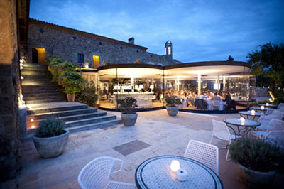
I have also added an image of a couple of the projects IOTA is ideally suited to being the outdoor public spaces. IOTA UK always told to me I need to get the planters in the landscaping of the Opera House so I have added that images as well.
Finally, I added some examples of typography that I liked personally but also thought was suitable for the brand.

This sets the tone and helps us move onto specific colours, textures and typography.
We don’t want to change things too much so we will stick with the two base colours of light and dark blue that are used for the logo.
Subtle variations of these blues can be used and I would like to introduce one more colour that is a bit brighter and contrasting with the current blues that will liven up the site.
I am thinking maroon, but we can use adobe Kuler to see what a good contrasting colour is mathematically.
These are the colours from the logo.
Light blue #8da5aa
Dark blue # 005293
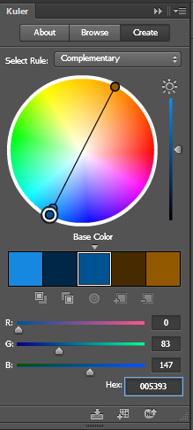 Without going too much into the details of how Adobe Kuler works, the end results speak for themselves. When I enter base color dark blue # 005293, the complimentary colour was a brown.
 That didn’t suit the objectives of livening the site up so if we look at the triad relationship I can see the magenta colour I was originally thinking of # a01410.
And if we look at how these colours look together touching each other and apart you can see Kuler’s maths have not let us down. These colours look great together.

Now we have our base colours we can go create a pallet of shades and variations of these.

Now to experimenting with fonts.
Currently the IOTA site is just in Arial font. We want something slightly more modern but not noticeably different. Here is a shortlist of some fonts that might be suitable.

I have used Arial as a control just to compare the others to. Ozwald is becoming very popular, but perhaps a bit too modern. I like Futura and it is what the IOTA logo is made from, but lean away from this as you have to pay for it on an annual basis, which would be ok, but since Google is offering over 100 fonts for free and storing them on their server for websites to use, it is very hard not to confine my selection to only Google fonts.
A Google font that is similar to Futura, at least in all caps is Josefin. I’m not convinced with this one until I see it on the site, however it is a strong contender.
Open Sans is a very easy font to read and a good balance of modern vs function. However, the lead contender at the moment is Roboto. Roboto also has the added advantage of having a Slab variant which is just little slabs or feet (serifs) on the ends of some of the letters. Roboto Slab can be used for sub-headings and offer a nice contrasting effect while still matching and without being too bold.
Redesign of IOTA Designer Planters Stage Three: Existing Site Design Review
Before we go any further we need to look at the existing assets we have and what needs to be changed. There is no point in recreating the wheel and there are some strong design elements already in place that we don’t want to lose.

Header.
All the elements of good site design are here but the layout could do with some tweaks and could be updated to reflect more recent devices such as phones and tablets. The site can be made wider so that when viewed on a large monitor makes better use of space. This is where responsive can be made for larger screens as well as smaller ones.
Some Issues
The phone number is essential to be seen on the home page, but no reason it should be bigger than the other text.
Gradient background fading to light blue doesn’t look too dated, but it probably will in 6 -12 months so advisable to go with a flat colour or a more subtle gradient or pattern.
Similarly, the top nav bar will look dated before long and should be modernised.
The header needs be made larger to allow for more space between the elements. Overall, the header is too squashy and the logo is too close to the main navigation. There was strong support from web design usability experts for squashing content up the page to get as much content “above the fold”, being able to be seen by the user without scrolling. There is now growing evidence to suggest that users are more willing to scroll and the sacrifice of space as a design element is greater than the return of condensing the content.
Calls to Action: Trade Customer? Download Catalogue and Shop Online and Tagline Designer Planters and the Address on the slider make good use of space without crowding anything and will be implemented in a similar fashion.
The font of the whole site is just variations of Arial. This was once good practice, but these restrictions are no longer necessary with the development of web typography and the huge range of fonts now available.
Home body.

All the elements are ok, but a bit dated. The large H1 welcome message was good for SEO years back but doesn’t have much benefit now that Google has gotten smarter. Similarly, the descriptions of company, customer, products etc. are jammed with keywords and probably don’t offer much user benefit. There is almost enough space to distinguish the various elements, the newsletter form and some information on the company and best-selling products.
The only thing needed here is a little more space, slightly modernised design, and revised fonts.
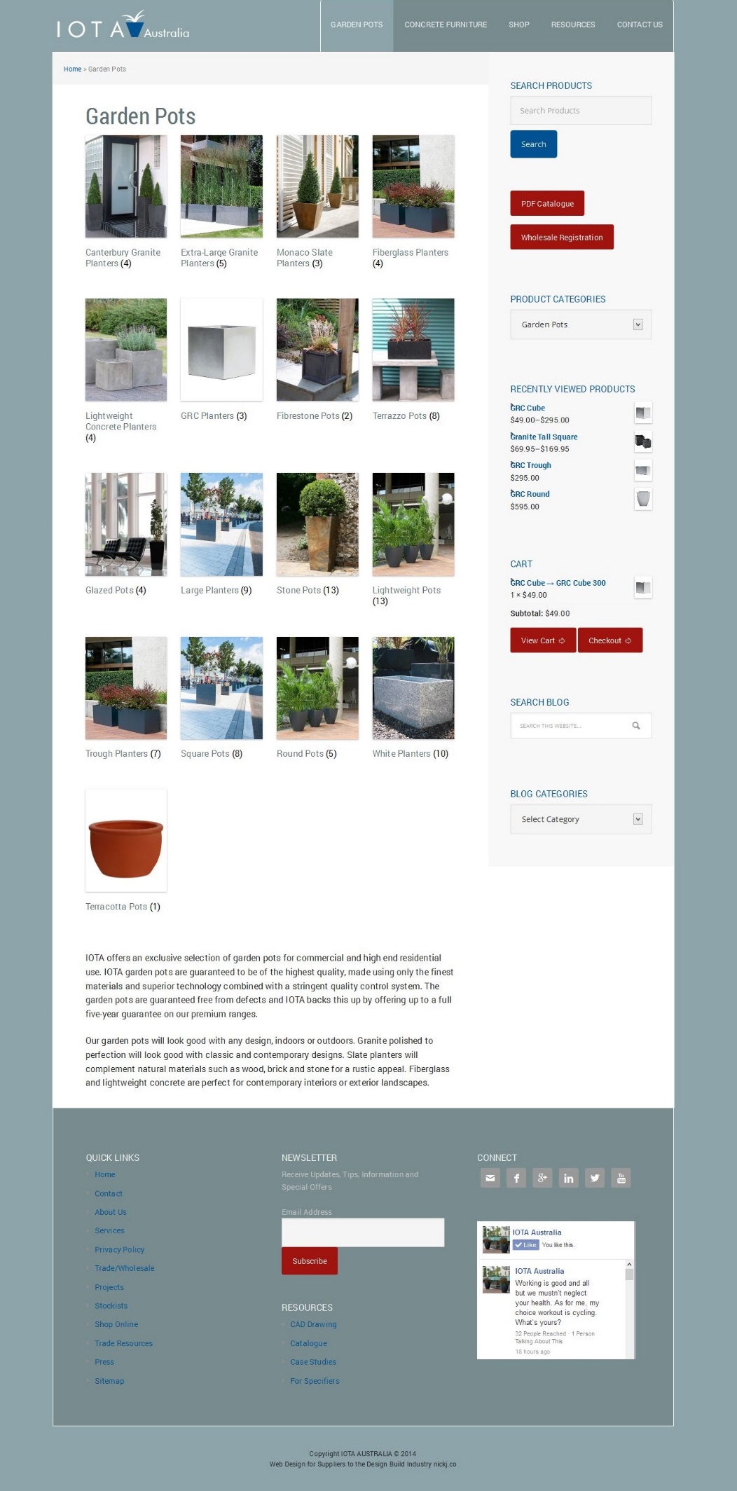
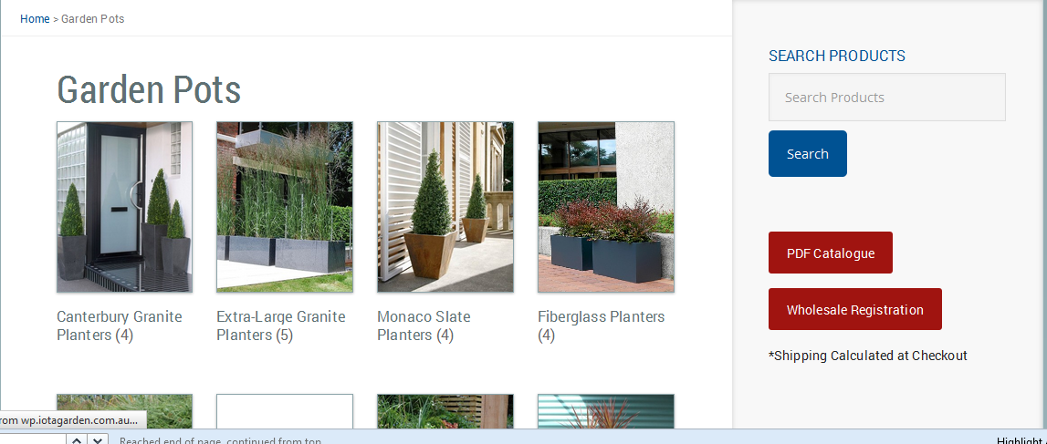
Top Level Categories.

http://www.iotagarden.com.au/garden-pots.html
The big chunk of text at the top describing the category could be broken up to allow users to scan the text as is what is normally done on the web. It could also include some of the call to actions that the home page has; Trade Customer? Download Catalogue and Shop Online.
The image grid of sub-categories works well for users who like a visual choice and there is also the left column where users can search by range, type, shape etc. These are the same options represented for different personality types of users and works well. Heat map tracking from www.crazyegg.com/ suggests that users use the images more often, but the text links also get a lot of clicks.
The shipping estimator is a useful tool and feedback from phone inquiries shows that customers use this regularly.
Sub Categories

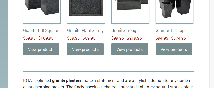
http://www.iotagarden.com.au/garden-pots/extra-large-granite.html
There are no major problems with this page. All the features that are needed are there and will be carried over to the new site. The only items that need changing have already been covered, including increased white space, updated typography, and responsive layout.

Similarly, the page level template above http://www.iotagarden.com.au/garden-pots/extra-large-granite/granite-taper.html and other pages have all the right elements and just need to be re-styled into a modern theme.
Any other design flaws we will address as we build the new site.
Redesign of IOTA Designer Planters Stage Four: Site Navigation and Wire Framing.
Site Navigation
Now that we have the overall look and feel for the site from our mood board, experimenting with typography and colour pallets, and reviewing the existing site, we can move on to site navigation, and wire-framing.
In the site navigation, we can decide what the website visitors are going to want to do when they get to the site and how we are going to lay it out so that they can complete the tasks they want to achieve.
Personas
A common way to do this is by using personas. We can invent some individuals that are reflective of our target market and imagine them coming to the site and trying to find what they want.
Jane is a landscape architect…
 …that is drawing a plan for a shopping center. In some of the paved areas, they require planters so she goes online and googles extra-large planters and finds IOTA. Jane has a specific need for extra-large planters that can either be fixed to the ground or are heavy enough to be immovable.
She wants to know the dimensions, weights, price and contact details. She also has a few other needs; however, she has not consciously identified them as clearly.
Jane is going to be specifying these and it is her name on the plan, she wants some level of comfort in knowing that they will do the job required of them.
In designing for Jane we need to make the following very easy for her to find:
[list style=”style1″]
[li]Ranges available[/li]
[li]Product specs[/li]
[li]Contact information[/li]
[/list]
And to give her some social proof to make her want to specify IOTA’s planters, we need to offer her some evidence by way of images and case studies of previous projects.
John is a restaurant owner…
 …and needs a barrier between his outside tables and the road. His gardener has recommended IOTA Planters to him.
John is not as sure what he wants and Jane so will be looking to browse a bit more. He is also not ready to make a decision right away so may want to print a catalogue he can take away and look at and/or sign up for updates.
He also likes to see some social proof and wants to get a feel from images and case studies how some of the ranges may look in his establishment.
In designing for John, we need to add a few things such as easy to find catalogue and newsletter subscription.
Real User Needs
While these are fictional, they do offer a perspective of a potential client and addresses what the users actually want to do. When we take the time to really think about what users want and walk in their shoes, even if for only a few minutes, it enables us to check our own thinking; and while recognising business objectives are important, it is the client that we are building the website for.
You will notice these users did not want to see the mission statement or an endless diatribe on how good the company is and what wonderful service they will get. It’s not that these things are not important, and not that the client won’t read that sort of company information, and may even look for it in making a final decision. However, it’s just not has high a priority as the details of the solution we are solving for them.
Site Architecture.
Here is a list of all the elements that the existing site has on the home page. I have marked them in order of priority.
KEY:
Top Priority
Medium Priority
Low Priority
———————–
Logo
Search
Phone Number
Utility Bar: Help | Login | My Cart
Navigation:
Garden Pots | Furniture | Planting Products | Resources | Wholesale | Contact | My Account
Product Image Slider
Call to Actions: Trade Customer | Dowload Catalogue | Shop Online
Video
Welcome Message
Newsletter
Social Icons
IOTA Top Selling Ranges
Our Company
Our Customers
Our Products
Our Services
Quick Links
Resources
Contact Details
Facebook Block
Copyright
Mobile First
 Since the explosion of mobile devices there has been a growing philosophy of designing for the smallest screen first. The idea behind this is that it makes you really prioritize given only a small amount of real estate to work with begs the question what do you want to see first and what is most important?
This focus on getting priorities right carries over to the larger desktop screens and the question must be asked if this item is not important enough for mobile then do we want it cluttering up our desktop site and potentially taking the focus away from the things we have deemed most important.
This is a new method of design for me and has been quite revealing. What do the visitors first want to see when they come to the site and as the business owner what do I want them to first see.
There are few standards like logo, contact and product search. After that I decided that the 4 core ranges IOTA provides was what I wanted visitors to see and what would ultimately give them the quickest way to find what they wanted.
Wire-framing
 Wire-framing is the process of removing the design elements from the layout to get a clearer understanding of information hierarchy of a design, making it easier to plan the layout according to how you want your user to process the information.
Here you can see a visual representation from our site navigation that starts to give some structure to the way we will present the elements.
We have our logo branding at the top and then easy access to contact info and phone number. If the client is out and about and needs to contact IOTA that may be the only information they require.
Then we have the navigation menu which is one button that will drop down and offer almost every link on the site.
Then the core product categories. The calls to action are items like PDF catalogue, wholesale registration and newsletter signup. It is debateable whether to have the calls to action or the core product categories first, but as the design progresses whatever is the most practical and usable will result, so these could be interchanged.
Then we have our company information, social icons and footer links. It doesn’t matter too much how long the page is as long as the important items are at the top and are easily accessible.
Now we have a clear understanding of what our site needs at it’s most basic structure we are going to move to prototyping where we can make this interactive and viewable in the web browser.
Redesign of IOTA Designer Planters Stage Five: Prototyping

Prototyping
Now it’s time to build a basic version of the site where the key focus is a functional design over visual design.
There’s not much point making the prettiest website in the world if users can’t find what they are looking for.
Often this process will be done in grey scale with images and text unrelated to the site. This is useful as it takes away a lot of the visual design aspects and forces you to focus on functional design.
It’s probably a limitation of my design ability and conceptual thinking process, but I find it much easier to think of the business solutions for the web when I am looking at images, text and concepts that remind me of and immerse me in the problem. So for that reason, I have added some colour, images and text related to the IOTA business.
I have been unable to find a prototyping tool that I find much easier to use than WordPress. Also the team and I are very familiar with WordPress and although we haven’t decided on a technology platform, if we were to decide on WordPress then we would be able to use a lot of the work already done in this prototyping exercise.
Watch the screencast
Mobile First.
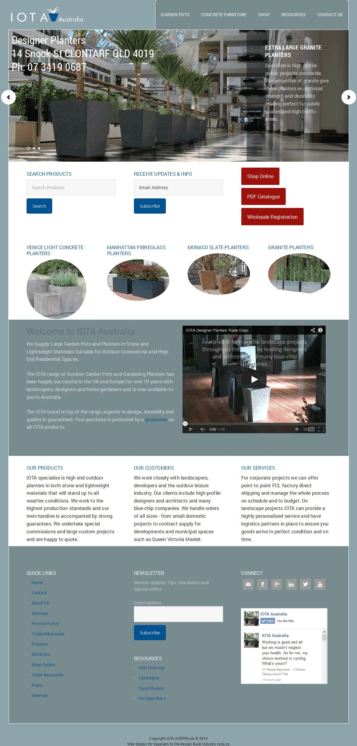
 Starting from the top of the page, we have the logo, drop down menu, product search, tag line “Designer Planters” and just the beginning of an image which will invite the user to scroll.
Next we have our series of branded images that will slide, contact details and 3 calls to action buttons followed by the products. All these calls to actions and products are available in the dropdown menu so they are really only more obvious visual representations of what is already there. We have evidence that these more visually appealing links are used from our statistics in crazyegg.com that show where visitors have historically clicked.
I think it is also useful for people to browse down the screen and see what we offer even if they don’t click anything just yet. At a glance they can see that we sell online, have a pdf catalogue, offer wholesale pricing and can then see our 4 core ranges.
Beyond that is the company information to get a bit more of a feel and trust in IOTA and then finally down the bottom to sign up for the newsletter if they want further updates.
Expanding the view
As the screen gets bigger we have more room to play, but also more design challenges to solve. The original site highlights the product categories on the slider. At first glance we have duplicated that experience, however there is a subtle difference and the copy to the right of the image tells a story more about the solution the planters solved than the product. It gives an insight into what others have used them for and offers the social proof that we identified earlier in our personas exercise as important.
The menu has expanded and moved to the top right of the logo and the product search feature has moved into the call to action row.
I also feel it is more appropriate to have a newsletter subscription box in this this section of the desktop site, whereas it felt a bit premature in the mobile version to be so high up in the content flow.
There are four core product categories so a four column layout for this section made sense. The different shapes of the product boxes are just experimentation and think the circle will win over the oval.
We have then added the rest of the content in a two column and three column layout and added additional contrast by changing the background colour of the “Welcome to IOTA Australia” Section and the footer to distinguish them as sections and make for easier reading.
Inner Pages
The next pages we want to look at are the inner pages that the call to actions and product images link to. Shop online links to a page which shows all the products categories available followed by some descriptive text. We had the option here to add the images or the description first and I opted for the images.
For the desktop version we have the option of a right utility column which is pretty standard on most websites for good reasons. Firstly, it’s more comfortable for the human eye to read content that is not too long, hence why newspaper articles are broken into chunks rather than across the whole paper, and secondly it is useful to have some aside information that relates to the main content such as additional navigation or items specific to that users visit like recently viewed products and cart information.
This sidebar is also a more appropriate place for the product search function in the full-sized site whereas on the small screen, we keep it right up the top. In the mobile version, everything in the sidebar becomes its own column below the main content. Again, taking a mobile first approach, this makes us question “what is the most important?”
Product Page
There is a bit more going on here as there are product options like size and the format goes to a three column layout in full size and single on the small (mobile) screen. We have been able to import the product specs and images from our live site for this exercise. Most of the styling here comes from the WordPress extension “Woocommerce” I am pretty happy with the Woocommerce interface and don’t feel much needs to be changed. The way in which they have ordered the elements like Heading, price, description, details etc. looks fine to me and I don’t feel any changes I was to make here would achieve a better result for the time invested.

Now we have a working prototype, it’s time to finalise the choice of platform we are going to use. We have narrowed it down to Magento which is what the current site is on and WordPress what we have built the prototype in. Stay tuned to see how we look at both platforms and decide what will give us the best return.
Redesign of IOTA Designer Planters Stage Six: Technology Decisions
Magento
At this stage we have not finalised on a platform. Currently the IOTA site is on Magento. Magento is a great platform offering a host of e-commerce solutions out of the box and endless customisation options. This does however make it complex and this complexity brings it’s own challenges.

Two stand out challenges for me are site speed and cost of development. Attention has been brought to site speed and SEO by comments from Google that site speed now plays an important part in how high your site is ranked in their search engine.
Amazon has also claimed many years ago that they see an increase in revenue of 1% for every 100ms their site is faster.
The 2nd issue is cost; as Magento is more complex it requires more skilled developers that have experience in Magento and any significant changes to the site need this level of expertise.
WordPress
WordPress on the other hand is much easier to manage; for example this nickj.co site is in WordPress and that annoying pop-up that tells you we are redesigning the IOTA site and asks you to subscribe cost me $20 and I installed it myself and had the whole task completed in under an hour.
I then attempted to do the same thing on the current IOTA Magento site. The extension cost me $50 and in the end took an hour and a half of my time and 2 hours of my developer’s time.
At this stage I am leaning towards WordPress and sacrifice a bit of flexibility for the reduction in expense. Also, IOTA only transacts 10% of business through the online shopping cart. The nature of the product often calls for a quote, decision-maker’s approval, followed up by an invoice etc. A heavily focused e-commerce solution is not the highest priority. Gardenware.com.au on the other hand is and I think the additional expense of Magento may be worth it for that case.
Business Requirements/Costs
 Before making a final decision I need to look at what the business requirements IOTA uses that already come standard with Magento and/or we have already configured from the existing site and what it will cost to add these on to WordPress.
If the additional expense of beefing up WordPress will be less than the extra development time needed for ongoing maintenance of a Magento site then we will change to WordPress.
After a thorough analysis it was a lot less than I thought. We needed a freight calculator and shopping cart integration with NAB with a combined estimated cost of $300.
We imported a few products from Magento into a WordPress install and estimated that entire process to be under $600.
The blog was already in a WordPress install that was integrated into Magento, so that was a 10-minute export/import process. There will need to be a manual review to make sure the formatting fits into the new theme – $100.
The forms and static pages like the About Us and Contact Us page are labour intensive to convert; but in WordPress I am able to have these done by one of my Philippine staff rather than highly paid Magento developers so can keep that down to under $300.
Getting Complicated
Customer accounts may be slightly tricky and we will need to purchase a plugin that will enable wholesale pricing to registered trade users. That part is easy enough, but getting the customer data out of Magento into WordPress may prove complicated, especially since they have encrypted passwords and is not a simple export-import process. Worst case scenario is I have to email all customers and ask them to reset their password and/or when existing customers try to login in a welcome screen will display explaining that on upgrading our site we were not able to retain their original password for security reasons and offer a link for an automated email to be sent to them with a password reset. Estimated cost $300-$500.

The Verdict
All in all, the cost of transferring over to WordPress from Magento will cost $1600-$1800 and I estimate that can be saved within the first 6 months. More importantly, further upgrades will be much cheaper. The rate at which technology is changing, especially in the online space websites that are not significantly upgraded every 12 months will start to slip behind the technology of the devices they are being viewed on and potentially lose significant revenue.
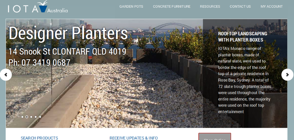
Redesign of IOTA Designer Planters Stage Seven: Final Design Review
 So here we have our final design. You will notice it is very similar to our prototype with just some visual design changes. The fact that it is so similar is testament to the fact we got most of it right and the process of that prototyping was extremely valuable.
In the prototype, not being too concerned with the visual design, we were able to allow ourselves to satisfice and get the functional aspects of the design nailed. In doing so, we actually got most of the visual design right and the important thing is we didn’t get bogged down doing it.
Watch the Screen Cast
Simplify
Some of the changes we did make were to simplify the top navigation, the decoration on the prototype I felt just didn’t offer enough value and therefore best to strip it out. I did however add some drop shadows to the sub-navigation so that it is better contrasted from the background and easier for viewers to read.
On the mobile we kept the navigation unchanged.
Who we are and what we do?
The tagline was made larger and the same length as the address. This is crucial as when people come to the site we want them to know 2 things straight away. Who we are and what we do. Hence Logo and tag line “Designer Planters”.
Next, we wanted to guide the user’s eyes from the Search Products and Receive Updates and Info input boxes to our calls to action (CTA) of Shop online, PDF Catalogue and Wholesale Registration. This has been achieved by the maroon line. This was effective, however it made a bit too much of the maroon colour and made the site feel a bit lop sided in the prototype when the CTA buttons were also maroon to me so we changed them to a grey with just the maroon border.
Before:

After:
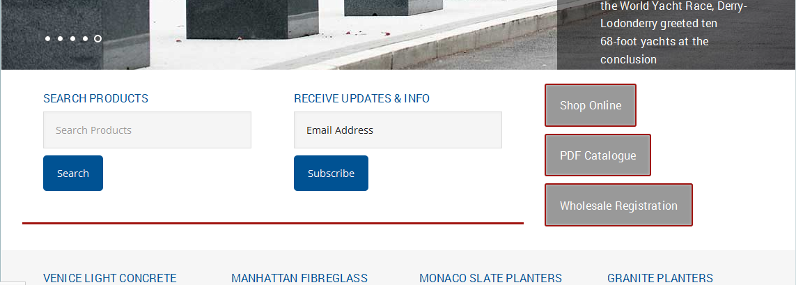
Although the grey is usually pretty dull in the instance it contracts so well with the surrounding colours and stands out while not looking too bold.
On the mobile size, everything is reduced to one column so we don’t have quite the issue of leading the eye. However the added decoration does help distinguish the various sections.
Ohhhhh the luxury
The colour maroon was chosen earlier in our mood board exercise as it added a brighter colour which I felt the existing site was missing and matched nicely with the blues we were using. Maroon is also a colour known for it’s psychological effect to convey luxury, sophistication and authority which is part of the personality we identified as IOTA.
The Inner Child

Some decoration has been added to the core products and when these are hovered over they appear to come out off the screen just a little. This resembles a looking glass and looks like we are offering a glimpse into the IOTA brands core ranges and is enticing the user to click forward and investigate further. For me it actually brings back powerful memories of Play School TV show and the square, arch and round windows, but maybe that’s just weird.
Small bites
As we go further down, we have added just a few more maroon lines on headings and between sections to both guide the users eye and distinguish the sections. This makes it easier for users to flow through the page and see the content in chunks and more easily distinguishable.

Making it easy and faster for users to move around the page actually makes them stay longer as they are more likely to engage with what they do find interesting.
Some of the colours in the footer have been modified to offer contrast and just a bit more visual appeal.
More is not always more!
If we now move on to one of the category pages, you can see just a bit of decoration on the products to help them stand out. I was tempted here to make the images circles like the home page, but thought it would just be too much and more is not always more!
The side bar we did decide to keep the CTA’s the maroon colour as it didn’t conflict with any other element on the page like it did on the home page and they certainly stand out in this colour.
Call to Action
When we go to the sub-category products there is a “view products” button. I didn’t feel this was really a call to action or needed to stand out more than the image which has the same link so just made this one match the background, but be a little darker offering just a hint of contrast..
However, the actual product page was appropriate to have the add to cart button our “luxurious” maroon colour because this is more of a call to action. Similarly the prices needed to stand out so that also got the maroon treatment.
Conclusion
All in all, I am very happy with the design and think it addresses all our original objectives of making the site responsive and more modern. I would love to hear what you think of the site. So please visit www.wp.iotagarden.com.au/ and be sure to comment on anything you see that is problematic before we go live and unleash it on the world!!
 Nickj Ecommerce Entrepreneur